A few of you may have noticed a recent change on our website - that's right, we've re-jigged our homepage and added a few more features that will hopefully show people a little bit more about who we are, what we do, and the sort of top notch artists that we get building websites around here!
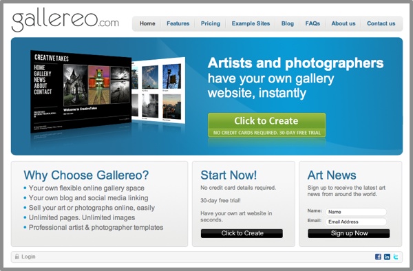
We understand that change can be difficult to deal with, so we haven't gone over the top for the time being. In case you don't remember what our old homepage looked like, here it is:
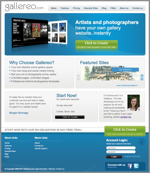
As a statement of what we provide, that homepage was ok, if not a bit bland. As we say, there hasn't been a massive leap in overall design, but we have added a few new features. Here's the newer version of the homepage as it stands now:
There were five main things that we wanted to do with the homepage to improve it, and hopefully make it more useful for everyone. Those things were:
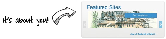
1) Showcase Your Talent!
First and foremost we wanted to create a space to show off the amazingly talented artists and photographers that we have here at Gallereo. So we added a carousel of featured sites so that anyone looking at Gallereo could browse through the artist list from the homepage, and select their sites to look at.
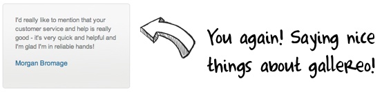
2) Showcase Your Voice!
We have had some wonderful feedback from people who are using Gallereo right now, and we wanted to give them some room to shout on the homepage. We really appreciate the support of our followers, and cannot thank them enough when they have really nice things to say about us.
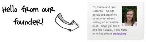
3) Say A Personal Hello
There was actually some debate as to whether there should be a personal hello on the homepage or not. The vote went to yes, and there you have a brief welcome message from our founder and lead art enthusiast! We're a friendly bunch who generally like to get to know the people that join us at Gallereo. The internet isn't always the most friendly place and it can be a really impersonal at times. Hopefully people will see that that doesn't always have to be the case.
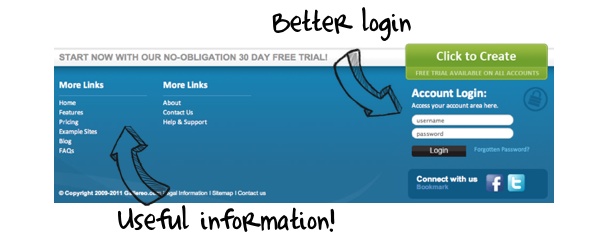
4) Making Logging in Easier for Our Members
Previously, you could log into your Gallereo website from the homepage if you wanted to…and to be honest, if you could find the log in panel…uh oh. We've addressed this by creating something which we hope if far easier to find, so that you can access your site quickly and effectively.
5) Making Information More Easily Available
A big thing that we've added is this huge links area at the bottom of the screen. A major reason for this is so that we can provide you with more information about things that you might actually be interested in. We're currently writing some more informative content for the site that artists and photographers working online might find useful, and we'll link to that content from here. Watch this space for more news about that in the next few weeks.
Overall we're pleased with the adjustments to the homepage, and hope that you are too. We'd love to get your views on the changes that we've made or even comments on how we can make it even better!


 START NOW WITH OUR NO-OBLIGATION 30 DAY FREE TRIAL!